Summary: In Review Assistant v2.0 we have completely redesigned the Code Review Board window. We have made efforts to make performance more straightforward, and to make the application UI more natural for Visual Studio 2012 and 2013.
This is the first article in a series of What’s New in Review Assistant 2.0.
While working on the new version of Review Assistant, we studied UX problems detected earlier. Solutions for many of these problems required application’s interface changes. We had started development of Review Assistant v 1.0 long before Visual Studio 2012 was released. That’s why the UI was more suitable for Visual Studio 2010. To go with the times we have decided to redesign the main window — Code Review Board.
Here is how the UI looks in the new version.
Dealing with ambiguity
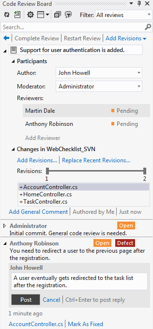
One of the most common UX problems was the ambiguity in the review statuses management process. A review status could be changed by clicking an appropriate button, even when a review was collapsed. There was also the possibility to do this by using a combobox, when the review was expanded. In such a case the Apply button had to be pressed.
In the new version of Review Assistant we have unified the way of changing reviews statuses. We have placed commands that allow you to change a review status on a toolbar, that is located above the review. These commands are available for users with respect to their roles and the current review status.
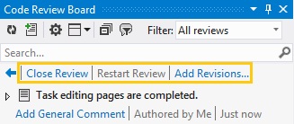
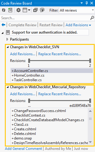
Multiple repositories in one review
One of the most wanted features was the ability to add files from multiple repositories to a single review. It was near impossible to implement such a feature, at least at that point in time, within the constraints of the existed interface.
Here is what we have after UI changes
Personalized review status
Another UX problem was to go throug the reviews list, and to take a decision on what to do about each review. Reviews’ statuses were shown as an icon. Such indication was not sufficient as the experience has shown. Users were hardly able to memorize intermediate review statuses. Having examined the reviews list (especially when the All reviews filter was enabled), users were unable to define whether they were involved in it.
To solve this problem we have decided to display personal statuses in a reviews list.
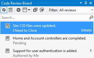
As you can see, the user can now define at a glance what they need to do about a specific review.
Start reviewing code
Download our peer code review tool and start reviewing code with Review Assistant for free today.
[…] It was one of the Review Assistant 2.0 features that required UI changes. […]