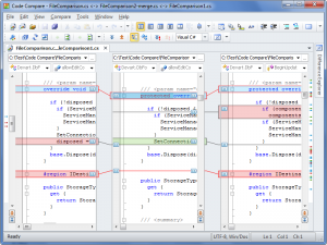
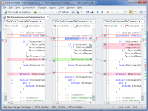
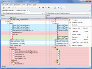
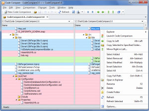
We have adjusted the UI of Code Compare and want to show the implemented changes further in this article.
First of all, we decided to get rid of all UI elements performing no practical function. And therewith, we rearranged toolbars and menus to make commands accessible in one click.
In this release, we strived to meet requests of our users complaining about the UI being overladen and unclear.
Here is what we’ve done in the new version of our comparison tool.
File Comparison UI


Changes
- The text comparison interface of Code Compare 3.0 has become more self-explanatory and user-friendly.
- We have removed the extra ‘chrome’ from it.
- The main menu of the merge tool has been extended with new commands.
- Toolbar content has been optimized.
- Menus and toolbars have been adjusted to a common design in the standalone and integrated Code Compare versions.
- Accessibility of some frequently used commands has been improved.
- Missing shortcuts have been reviewed and added.
Folder Comparison UI


Changes
- Commands for navigation through changes have been implemented.
- Commands for multiple files selection by the type of change have been added.
- Extra “chrome” has been removed from the comparison document.
- The comparison document pop-up menu has been rearranged.
Feel free to comment on this post and share what you think.

While comparing two or three files side by side, is there an option to display just the currently selected lines above/below each other, such that you can then see much more text in long lines? Difference highlighting should also be applied to these stacked lines, making the in-line differences very obvious.
Currently there is no such functionality in the product. But this feature is on our road-map. Vote for Stacked Current Line View to push it to the top.
I’d like to sugget a feature for Code Compare.
I hope the Code Compare can do the ‘project file’ based files/folder comparsion and they are not limited to a single path. The use case is that I might have a couple of files or directories related to one of my daily tasks that spreated out around all of my HDs. I wish it can shows their differences right after the project file opened.
This idea came up monthes ago and I’ve posted in somewhere I don’t remember. And there was a guy suggest me to forward it here. Here I come.